Welcome to the new look WAMRC web site! We have been carrying out some pretty extensive renovations in the background over the past few months, and the change of the home page marks the culmination of that work.
Most of the changes are behind the scenes (read more below if you are interested in the technical details), but one of the most obvious changes is the addition of a dynamic news “blog” on the home page. This will not only be used to provide a log of updates on what has changed in the web site (such as this entry), but also to provide updates of current news and activities at the club. Another noticeable change is the use of embedded Google Maps on the new About page, which now incorporates the information that used to be held on both the old home page and the visitors page.
Behind the scenes, the site has been totally updated to get rid of the old-style table based formatting — now all pages are laid out using divisions and cascading style sheets (CSS) position specifications. This not only makes the site faster to load (as the pages are physically smaller), but also means they are now more accessible to people using screen reading software. As a bonus, when printing pages from the web site, they no longer waste a third of the page on the left hand side as the navigation menu only shows up when viewing it on the screen, not in print.
We hope you enjoy the new look web site — and remember you can even provide feedback and comments by clicking on the “comments” link below each entry in this blog!
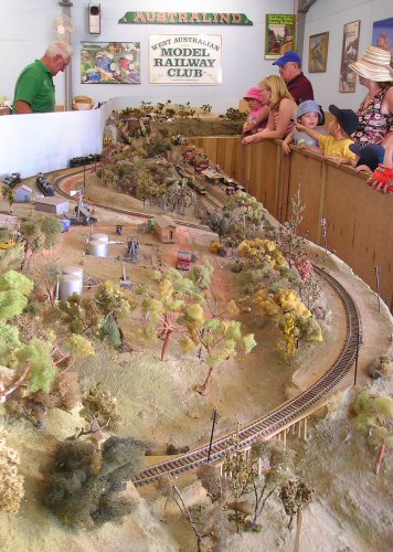
Image: Public HO Display Layout at the WAMRC
